


Select Color widget
Introduction
The Select Color widget makes it possible to select a color at runtime to change the value of properties such as Color (border color, text color, background color, etc.) of the style sheets and individual graphical objects in the project.
Through the widget linear indicators, the user can set the desired color in RGB format and adjust the opacity level. The color is displayed together with its hexadecimal code.
How It Appears
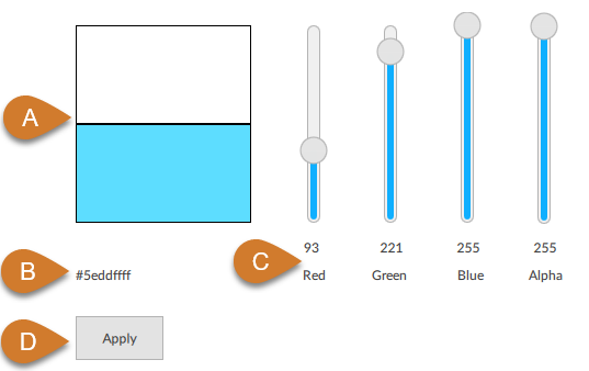
Part |
Description |
|---|---|
A |
Color preview (previous color and selected color with widget indicators) |
B |
Hexadecimal value of the color |
C |
Indicators to select the color and opacity (Alpha = indicator of the opacity). |
D |
Button to set the hexadecimal value displayed in the widget to the value of the Color property changed by the widget. |
Configures a Select Color
Click
 to open the template library.
From Widgets, drag Select Color into a container of your choice in the UI node: an instance of the widget appears.
To link the widget to the desired style sheet property, next to the Color property of the Select Color panel, click
 : the Dynamic Link Window opens.
In the UI node, click the desired style sheet, then the desired Color property, then click Select. For example, if you select the Text color property among the global properties of a style sheet, with the widget you can change this property at runtime for all graphical objects in the project.