


Button
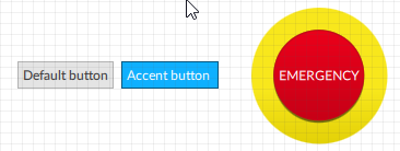
How It Appears
Below are three buttons with different styles:
Applications
Typically used both to perform actions inside the Q Application, for example to start the generation of a report, and to perform actions on the PLC/machine, for example to acknowledge active alarms or to signal an emergency condition. Can contain text or an image.
Events
Below are the events that the object can generate:
Event |
Generated at runtime when |
|---|---|
MouseClick event |
An object is clicked/touched and released |
MouseDown event |
Click/touch on the object |
MouseUp event |
A click/touch is released |
Properties
Name |
BrowseName |
DataType |
Description |
|---|---|---|---|
| Text | Text |
Text inserted and displayed |
|
| Appearance | Appearance |
Button style |
|
| Image path | ImagePath |
Icon to be displayed in the navigation tab of a Navigation panel object. |
|
| Image position | ImagePosition |
Position of the image to display |
|
| Text position | TextPosition |
Position of the text on the horizontal and vertical axes relative to the sides of the object |
|
| Image width | ImageWidth |
Width of the image to display. The Auto value sets the native width of the image. |
|
| Image height | ImageHeight |
Height of the image to display. The Auto value sets the native height of the image. |
|
| Word wrap | WordWrap |
Enable/disable the automatic word wrapping when the text is wider than the container. Ignored when the object width is automatic or when text abbreviation is set. |
|
| Text trimming | Elide |
Text trimming mode. Insert three dots (“…”) in the indicated position when the text is too long for the available space. Ignored when the object width is automatic or when word wrap is set. |
|
| Font family | FontFamily |
Font family |
|
| Font weight | FontWeight |
Font weight |
|
| Font italic | FontItalic |
Enables/disables italics in the text |
|
| Font size | FontSize |
Font size |
|
| Text color | TextColor |
Color of the text to display |
|
| Background color | BackgroundColor |
If the substyle Name = Default, Bordered Circular or Bordered Rectangular, it is the color of the button. If the substyle Name = Accent, the color is the one set in the style sheet in the Highlight color property. |
|
| Visible | Visible |
Show/hide the window.
(Inherited from Element)
|
|
| Enabled | Enabled |
Enables/disables the interaction with the user (True = enabled; False = disabled).
(Inherited from Element)
|
|
| Opacity | Opacity |
Opacity level (0 = transparent)
(Inherited from Element)
|
|
| Left margin | LeftMargin |
(Only if Horizontal Alignment = Left or Center or Stretch) Distance between the left edge of the object and the left edge of its container.
(Inherited from Element)
|
|
| Top margin | TopMargin |
(Only if Vertical Alignment = Top or Center or Stretch) Distance between the top edge of the object and the top edge of its container.
(Inherited from Element)
|
|
| Right margin | RightMargin |
(Only if Horizontal Alignment = Right or Center or Stretch) Distance between the right edge of the object and the right edge of its container.
(Inherited from Element)
|
|
| Bottom margin | BottomMargin |
(Only if Vertical Alignment = Bottom or Center or Stretch) Distance between the bottom edge of the object and the bottom edge of its container.
(Inherited from Element)
|
|
| Width | Width |
Width of the window. It can assume values greater than or equal to zero. The Auto value sets the width equal to the width of the content (in this case, in the absence of content the object collapses).
(Inherited from Element)
|
|
| Height | Height |
Height of the window. It can assume values greater than or equal to zero. The Auto value sets the height equal to the height of the content (in this case, in the absence of content the object collapses).
(Inherited from Element)
|
|
| Horizontal alignment | HorizontalAlignment |
Alignment of the object on the horizontal axis. Left = the left side is positioned on the left side of the container, except for the left margin; Right = the right side is positioned on the right side of the container, except for the right margin; Center = the center of the object is positioned in the center of the container, except for the left and/or right margins; Stretch = object width equals container width, except for the left and/or right margins.
(Inherited from Element)
|
|
| Vertical alignment | VerticalAlignment |
Alignment of the object on the vertical axis. Top = the top side is positioned on the top side of the container, except for the top margin; Bottom = the bottom side is positioned on the bottom side of the container, except for the bottom margin; Center = the center of the object is positioned in the center of the container, except for the top and/or bottom margins; Stretch = object height equals container height, except for the top and/or bottom margins.
(Inherited from Element)
|
|
| Rotation | Rotation |
Rotation of the object around its center point. Positive values indicate clockwise arc degrees.
(Inherited from Element)
|
Events
MouseClick event
BrowseName: MouseClickEvent
MouseDown event
BrowseName: MouseDownEvent
MouseUp event
BrowseName: MouseUpEvent