


Navigation panel
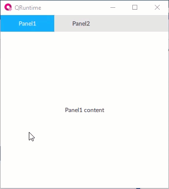
How It Appears
Below is an example of panel with two navigable panels:
Configuring the object
Set the panels to display
The panels to display must already be defined as widgets in the project. To display a panel via this object, do the following:
In the Panels property, click
 and set the panel properties.
If useful, set a title and/or an icon to display in the relative navigable tab.
Note
the Panel alias node of each navigable panel makes it possible to specify the node to which any alias present inside the panel points. It is possible to set this node via dynamic link to another node or via the Change panel method invoked by a NetLogic, by another object (e.g. a button), or by an OPC UA client. In this way, for example, it is possible to set the same panel for different tabs, but with different aliases, therefore different displayed values.
Use the object at runtime
At runtime, the object contains only the nodes of the displayed panel. At start-up it displays the first panel among those set. When the tab of another panel is clicked, it deletes the nodes of the current panel and creates the nodes of the new panel.
At runtime, the object also displays the current Panel variable, whose value is the NodeId of the displayed panel node.
Properties
Name |
BrowseName |
DataType |
Description |
|---|---|---|---|
| Current panel | CurrentPanel |
Node ID of the node of the panel displayed |
|
| Tab position | TabPosition |
Position of the navigation tabs on the y axis |
|
| Panels | Panels |
Collection of NavigationPanelItem |
Collection of Panel objects to display |
| Visible | Visible |
Show/hide the window.
(Inherited from Element)
|
|
| Enabled | Enabled |
Enables/disables the interaction with the user (True = enabled; False = disabled).
(Inherited from Element)
|
|
| Opacity | Opacity |
Opacity level (0 = transparent)
(Inherited from Element)
|
|
| Left margin | LeftMargin |
(Only if Horizontal Alignment = Left or Center or Stretch) Distance between the left edge of the object and the left edge of its container.
(Inherited from Element)
|
|
| Top margin | TopMargin |
(Only if Vertical Alignment = Top or Center or Stretch) Distance between the top edge of the object and the top edge of its container.
(Inherited from Element)
|
|
| Right margin | RightMargin |
(Only if Horizontal Alignment = Right or Center or Stretch) Distance between the right edge of the object and the right edge of its container.
(Inherited from Element)
|
|
| Bottom margin | BottomMargin |
(Only if Vertical Alignment = Bottom or Center or Stretch) Distance between the bottom edge of the object and the bottom edge of its container.
(Inherited from Element)
|
|
| Width | Width |
Width of the window. It can assume values greater than or equal to zero. The Auto value sets the width equal to the width of the content (in this case, in the absence of content the object collapses).
(Inherited from Element)
|
|
| Height | Height |
Height of the window. It can assume values greater than or equal to zero. The Auto value sets the height equal to the height of the content (in this case, in the absence of content the object collapses).
(Inherited from Element)
|
|
| Horizontal alignment | HorizontalAlignment |
Alignment of the object on the horizontal axis. Left = the left side is positioned on the left side of the container, except for the left margin; Right = the right side is positioned on the right side of the container, except for the right margin; Center = the center of the object is positioned in the center of the container, except for the left and/or right margins; Stretch = object width equals container width, except for the left and/or right margins.
(Inherited from Element)
|
|
| Vertical alignment | VerticalAlignment |
Alignment of the object on the vertical axis. Top = the top side is positioned on the top side of the container, except for the top margin; Bottom = the bottom side is positioned on the bottom side of the container, except for the bottom margin; Center = the center of the object is positioned in the center of the container, except for the top and/or bottom margins; Stretch = object height equals container height, except for the top and/or bottom margins.
(Inherited from Element)
|
|
| Rotation | Rotation |
Rotation of the object around its center point. Positive values indicate clockwise arc degrees.
(Inherited from Element)
|