


Dropdown button
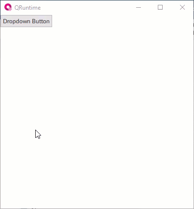
How It Appears
Configuring the object
The Panel alias node property makes it possible to specify the node to which any alias inside the panel to display points. It is possible to set this node via dynamic link to another node or via the Change panel method invoked by a NetLogic, by another object (e.g. a button), or by an OPC UA client. In this way it is possible to set the same panel for different buttons, but with different aliases, and therefore different displayed values.
Use the object at runtime
At runtime the object creates at each opening click, and deletes at each closing click, the nodes of the set panel.
If there is not enough space in width and/or height with respect to the set opening direction, the panel is opened in the opposite direction.
Properties
Name |
BrowseName |
DataType |
Description |
|---|---|---|---|
| Panel | Panel |
Panel to be displayed. Must be a widget. |
|
| Panel alias node | PanelAliasNode |
Node to which to point any alias in the panel to be displayed. |
|
| Animation | AnimationType |
Type of opening/closing animation. |
|
| Close on click inside | CloseOnClickInside |
Close the pop-up panel when clicking inside its area. |
|
| Close on click outside | CloseOnClickOutside |
Close the pop-up panel when clicking outside its area. |
|
| Direction | Direction |
Direction of opening/closing of the panel, horizontal or vertical. |
|
| Text | Text |
Text inserted and displayed
(Inherited from Button)
|
|
| Appearance | Appearance |
Button style
(Inherited from Button)
|
|
| Image path | ImagePath |
Icon to be displayed in the navigation tab of a Navigation panel object.
(Inherited from Button)
|
|
| Image position | ImagePosition |
Position of the image to display
(Inherited from Button)
|
|
| Text position | TextPosition |
Position of the text on the horizontal and vertical axes relative to the sides of the object
(Inherited from Button)
|
|
| Image width | ImageWidth |
Width of the image to display. The Auto value sets the native width of the image.
(Inherited from Button)
|
|
| Image height | ImageHeight |
Height of the image to display. The Auto value sets the native height of the image.
(Inherited from Button)
|
|
| Word wrap | WordWrap |
Enable/disable the automatic word wrapping when the text is wider than the container. Ignored when the object width is automatic or when text abbreviation is set.
(Inherited from Button)
|
|
| Text trimming | Elide |
Text trimming mode. Insert three dots (“…”) in the indicated position when the text is too long for the available space. Ignored when the object width is automatic or when word wrap is set.
(Inherited from Button)
|
|
| Font family | FontFamily |
Font family
(Inherited from Button)
|
|
| Font weight | FontWeight |
Font weight
(Inherited from Button)
|
|
| Font italic | FontItalic |
Enables/disables italics in the text
(Inherited from Button)
|
|
| Font size | FontSize |
Font size
(Inherited from Button)
|
|
| Text color | TextColor |
Color of the text to display
(Inherited from Button)
|
|
| Background color | BackgroundColor |
If the substyle Name = Default, Bordered Circular or Bordered Rectangular, it is the color of the button. If the substyle Name = Accent, the color is the one set in the style sheet in the Highlight color property.
(Inherited from Button)
|
|
| Visible | Visible |
Show/hide the window.
(Inherited from Element)
|
|
| Enabled | Enabled |
Enables/disables the interaction with the user (True = enabled; False = disabled).
(Inherited from Element)
|
|
| Opacity | Opacity |
Opacity level (0 = transparent)
(Inherited from Element)
|
|
| Left margin | LeftMargin |
(Only if Horizontal Alignment = Left or Center or Stretch) Distance between the left edge of the object and the left edge of its container.
(Inherited from Element)
|
|
| Top margin | TopMargin |
(Only if Vertical Alignment = Top or Center or Stretch) Distance between the top edge of the object and the top edge of its container.
(Inherited from Element)
|
|
| Right margin | RightMargin |
(Only if Horizontal Alignment = Right or Center or Stretch) Distance between the right edge of the object and the right edge of its container.
(Inherited from Element)
|
|
| Bottom margin | BottomMargin |
(Only if Vertical Alignment = Bottom or Center or Stretch) Distance between the bottom edge of the object and the bottom edge of its container.
(Inherited from Element)
|
|
| Width | Width |
Width of the window. It can assume values greater than or equal to zero. The Auto value sets the width equal to the width of the content (in this case, in the absence of content the object collapses).
(Inherited from Element)
|
|
| Height | Height |
Height of the window. It can assume values greater than or equal to zero. The Auto value sets the height equal to the height of the content (in this case, in the absence of content the object collapses).
(Inherited from Element)
|
|
| Horizontal alignment | HorizontalAlignment |
Alignment of the object on the horizontal axis. Left = the left side is positioned on the left side of the container, except for the left margin; Right = the right side is positioned on the right side of the container, except for the right margin; Center = the center of the object is positioned in the center of the container, except for the left and/or right margins; Stretch = object width equals container width, except for the left and/or right margins.
(Inherited from Element)
|
|
| Vertical alignment | VerticalAlignment |
Alignment of the object on the vertical axis. Top = the top side is positioned on the top side of the container, except for the top margin; Bottom = the bottom side is positioned on the bottom side of the container, except for the bottom margin; Center = the center of the object is positioned in the center of the container, except for the top and/or bottom margins; Stretch = object height equals container height, except for the top and/or bottom margins.
(Inherited from Element)
|
|
| Rotation | Rotation |
Rotation of the object around its center point. Positive values indicate clockwise arc degrees.
(Inherited from Element)
|