


Data grid
How It Appears
Applications
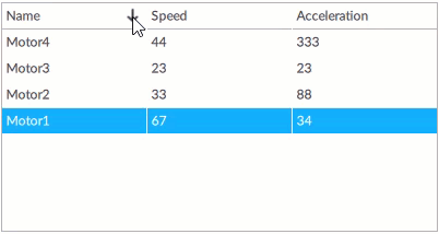
Typically used to display data in tabular format: texts, editable texts or images.
Each table row presents data from a different project node or from a different row of a database table.
Configuring the object
Set the data source
In the Model property set the parent node of an information model of interest or a database-type object:
If a link with a parent node is set, the displayable data are the values of the attributes or properties of all the direct child nodes and the type indicated in the ItemKind property. Typically this refers to a collection of objects with the same or similar information model… Note:: Q Studio automatically sets the ItemKind property with the object type/variable recognized among the child nodes. For example, if the model is based on a folder node that contains several instances of a Motor object type, ItemKind is automatically set with the reference to the Motor type. In this case, the values that can be displayed in the different columns are the values of the attributes or properties of the different instances (Motor1, Motor2, Motor3, etc.).
When the model is a database-type object, the data that can be displayed are the values contained in its tables.
Set the data to display in the column
For each data to display, configure a different column as follows:
Click + near Columns and select the column type.
In DataItemTemplate, in the Text or Path property, via dynamic link, set the date to display.
If the data source is… |
Then in the dynamic links window… |
|---|---|
a model of nodes |
in Alias > {Item}(object path) the alias of the object set in ItemKind is available. Select the desired attribute or property, then click Select. |
a database-type object |
in Alias > {Item}(object path) >**PointedNode** write the name of the desired column of the database table, then click Select. |
Set the sorting of data
Depending on the reference model, by default the rows are arranged in the same order as the nodes in the model or the rows in the database tables.
To make the data of a column sortable in ascending and descending order at runtime, it is necessary to set the Sort by property of that column.
If the data source is… |
Then the value of the Sort by property is… |
|---|---|
a model of nodes |
a reference to an attribute or a property of the model node. |
a database-type object |
a reference to a table column. |
The sort order can therefore be determined by data other than those displayed in the grid at runtime. If this is not needed, set Sort order with the same attribute/property or column from which the data are obtained.
Display the data in real time at runtime
When the data are taken from tables in a database, to display the data updated in real time, for example when displaying data sampled by a Data logger, configure the call of the Update method displayed by the Data grid object. Typically, this method is associated with Button object event.
Properties
Name |
BrowseName |
DataType |
Description |
|---|---|---|---|
| Model | Model |
Reference to the information model or database from which to obtain the data |
|
| Query | Query |
Standard SQL query to filter the data of interest. It can be used both to filter data from a database and to filter data obtained from a node-based model. In case of a node-based model, the SELECT * FROM Model part is mandatory, followed by the WHERE clause with which to indicate the search conditions - e.g.: SELECT * FROM Model WHERE Speed > 40. |
|
| Selected item | SelectedItem |
Element selected when the object is initialized at runtime (if empty, it is initialized without selections). After initialization, this property displays the node corresponding to the selected element (access to the property is both read and write when the data are obtained from project nodes, read-only when obtained from a database). |
|
| UI selected item | UISelectedItem |
||
| Allow deselection | AllowDeselection |
||
| Sort column | SortColumn |
Default sort column |
|
| Sort order | SortOrder |
Default sort order, ascending or descending, of the elements |
|
| Columns | Columns |
Collection of DataGridColumn |
Column to display in a Data grid object. |
| ViewModels | ViewModels |
||
| Visible | Visible |
Show/hide the window.
(Inherited from Element)
|
|
| Enabled | Enabled |
Enables/disables the interaction with the user (True = enabled; False = disabled).
(Inherited from Element)
|
|
| Opacity | Opacity |
Opacity level (0 = transparent)
(Inherited from Element)
|
|
| Left margin | LeftMargin |
(Only if Horizontal Alignment = Left or Center or Stretch) Distance between the left edge of the object and the left edge of its container.
(Inherited from Element)
|
|
| Top margin | TopMargin |
(Only if Vertical Alignment = Top or Center or Stretch) Distance between the top edge of the object and the top edge of its container.
(Inherited from Element)
|
|
| Right margin | RightMargin |
(Only if Horizontal Alignment = Right or Center or Stretch) Distance between the right edge of the object and the right edge of its container.
(Inherited from Element)
|
|
| Bottom margin | BottomMargin |
(Only if Vertical Alignment = Bottom or Center or Stretch) Distance between the bottom edge of the object and the bottom edge of its container.
(Inherited from Element)
|
|
| Width | Width |
Width of the window. It can assume values greater than or equal to zero. The Auto value sets the width equal to the width of the content (in this case, in the absence of content the object collapses).
(Inherited from Element)
|
|
| Height | Height |
Height of the window. It can assume values greater than or equal to zero. The Auto value sets the height equal to the height of the content (in this case, in the absence of content the object collapses).
(Inherited from Element)
|
|
| Horizontal alignment | HorizontalAlignment |
Alignment of the object on the horizontal axis. Left = the left side is positioned on the left side of the container, except for the left margin; Right = the right side is positioned on the right side of the container, except for the right margin; Center = the center of the object is positioned in the center of the container, except for the left and/or right margins; Stretch = object width equals container width, except for the left and/or right margins.
(Inherited from Element)
|
|
| Vertical alignment | VerticalAlignment |
Alignment of the object on the vertical axis. Top = the top side is positioned on the top side of the container, except for the top margin; Bottom = the bottom side is positioned on the bottom side of the container, except for the bottom margin; Center = the center of the object is positioned in the center of the container, except for the top and/or bottom margins; Stretch = object height equals container height, except for the top and/or bottom margins.
(Inherited from Element)
|
|
| Rotation | Rotation |
Rotation of the object around its center point. Positive values indicate clockwise arc degrees.
(Inherited from Element)
|
Events
Selection changed
BrowseName: UserSelectionChanged